DATA STRUCTURES

Data Structures
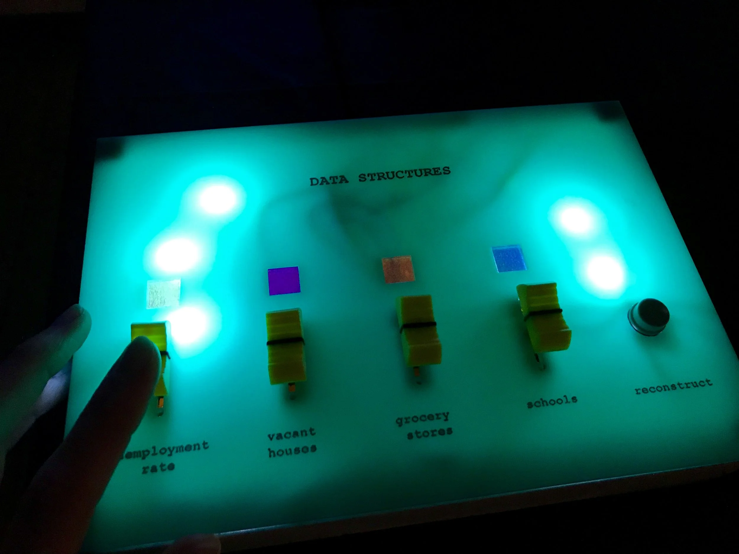
Data Structures is an interactive data visualization. It is made of five 5x5 inch styrofoam cubes, each representing a different neighborhood in Chicago. Using a control box with sliders, viewers can choose four different datasets to project onto the cubes: unemployment rate, vacant houses, grocery stores and schools. Moving the sliders changes the emphasis that is put on each dataset - represented in the piece by the visual weight of each color. Viewers can also re-draw the same data in a different pattern using the “reconstruct” button.


Motivation
The Concept
My hope is that by engaging with this piece, viewers think about the different stories we tell with data and how the datasets we choose to include, emphasize or the way we arrange them tells a very different story.
I previously worked in public policy research, which included conducting data analyses with datasets similar to the ones presented in this project. This piece was motivated by the frustration I sometimes felt with the limitations that come with using data to tell a story and wanting to make a visual exploration of that process.
The Name
In domains such as data science and computer science, data structures are used to organize datasets for analysis. Raw data have to be cleaned and re-structured before they can be put into algorithms and help in decision making:
“In computer science, a data structure is a data organization, management and storage format that enables efficient access and modification. More precisely, a data structure is a collection of datavalues, the relationships among them, and the functions or operations that can be applied to the data.” — Wikipedia


These images of different data structures are from Beau Carnes on medium.
"We take all of these tags and the user behaviour data and then we use very sophisticated machine learning algorithms that figure out what’s most important - what should we weigh," Yellin says. "How much should it matter if a consumer watched something yesterday? Should that count twice as much or ten times as much compared to what they watched a whole year ago? How about a month ago? How about if they watched ten minutes of content and abandoned it or they binged through it in two nights? How do we weight all that? That’s where machine learning comes in.”
-- Todd Yellin, Netflix’s vice president of product innovation (in Wired).
The Interaction
When machine learning is used to make decisions - say when Netflix suggests a show for you or judges are given suggested bail decisions - large datasets are used as “training data” to create an algorithm that will then be applied to “test data” to see how accurate it is. These kinds of algorithms are essentially created by weighting some datasets (or variables) more heavily and other less so - essentially, relying on some more than others to make decisions. For example, if you were to tell a computer how to guess which show you would want to watch next, which attributes would you emphasize most? Genre or actors or year produced? The reality is that machine learning algorithms get much more specific than this. The challenge of using this approach is that we can’t see inside this black box - we don’t know exactly which variables the algorithm is relying on or how much. My project asks, what happens when we are using social data instead of movie data? And what will you do when you have the controls?

A simpler analogy for my project is a linear regression model in statistics/economics. You have a dependent variable Y that you are trying to model using independent variable(s) X. How much of X1 and X2 do you take into account to predict Y? The multipliers or coefficients assigned to each X are also called “beta” values as seen in the equation above.
The viewer in my project is able to use the sliders to change these beta values (in regression terms) or weights (in machine learning terms) given to data. If placed in an algorithm, these would result in very different outcomes. In this piece, it results in a different visual story.
The Form


This project was also inspired by discussions at the Adjacent Conference at ITP about what embodied data would look like (which is a similar idea to physical or tangible computing - Lisa Jamhoury had a great article in the Adjacent Journal about this). The motivation for creating a projection and physical controls came from this desire to remove data visualizations from the computer and put it back in people’s hands.

For the five cubes, I chose neighborhoods from across the city of Chicago: north, south and west.

The neighborhoods included in this project are highlighted in black on the map. This map is from the Institute for Housing Studies (link).

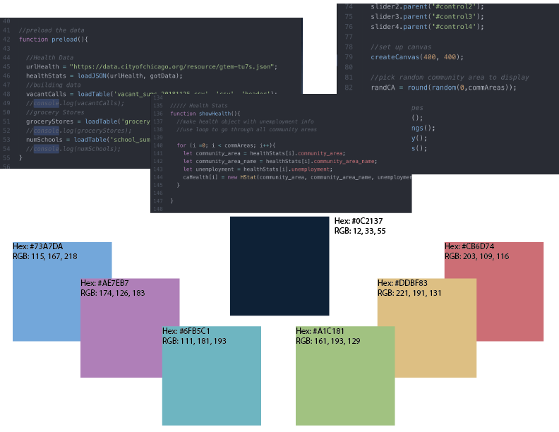
As a final related note, the color scheme is taken from data analysis software editors (Atom specifically) as a reference to the piece giving people without a coding background the ability to manipulate data.
How It Works
I am using p5.js to draw the shapes and colors that are projected onto the cubes. The data are from the Chicago Open Data Portal. For one dataset, I am using the live API and for the three others I downloaded the data first in csv format and cleaned and summarized it in R before importing it into the sketch. In p5.js, I created objects for each data type and arrays of these objects that could be accessed by using the community area number. I then created a grid system and accessed the specific community area in each array of objects to get and draw the number of squares corresponding to that data point. Each dataset is drawn by picking a random grid coordinate and then looking for open grid spaces around it. The re-construct button simply re-runs the grid drawing process. The size of each square that is drawn is determined by the slider values, which was at first html sliders and then for the show became physical sliding potentiometers.
For the control box, I am using four sliding potentiometers and a button, which an Arduino reads as inputs and then sends serially to the computer. In my p5.js code, I read in these values and map them to the values for the size of each box being drawn.
In order to do the projection mapping I am using MadMapper and ScreenCaptureSyphon to use my Chrome webpage as the source.
Click here to see the online demo version with html sliders.
Click here to see the code on Github (this will not run without sliding potentiometers).
Acknowledgments
Thank you to Luisa Pereira for teaching me P5.js and for technical help during this project. Thank you to Dana Elkis, Hannah Tardie and Winnie Yoe for design and concept feedback, Mark Kleeb for teaching me how to fabricate things, Jeff Feddersen for teaching me physical computing, my whole ICM class and Allison Behringer for user testing, and finally thank you to Matt Ross and Dana Elkis (again) for installation help and support during the ITP Winter Show.